Q&A 13 How do you create a Manhattan plot from GWAS results using the ggplot2 package?
13.1 Explanation
A Manhattan plot visualizes the results of a genome-wide association study (GWAS) by plotting each SNP’s chromosomal position against the –log10(p-value) of its association with a trait. High peaks represent SNPs with strong associations.
To create a Manhattan plot using the ggplot2 package:
- You must first merge the GWAS result table with SNP position data (e.g., from a
.mapfile). - The –log10(p-value) is computed to scale the plot.
- Cumulative genomic positions are calculated to plot SNPs across chromosomes on a continuous axis.
- Alternating colors help visually separate chromosomes.
13.2 R Code
# Load required libraries
library(tidyverse)

# Step 1: Load GWAS results and SNP position data
gwas_df <- read_csv("data/gwas_results.csv")
map_df <- read_tsv("data/sativas413.map",
                   col_names = c("CHR", "SNP", "GEN_DIST", "BP_POS"),
                   show_col_types = FALSE)

# Step 2: Merge GWAS results with chromosome position
gwas_annotated <- left_join(gwas_df, map_df, by = "SNP") %>%
  drop_na()  # Remove SNPs with missing position

# Step 3: Compute cumulative position for plotting across chromosomes
gwas_annotated <- gwas_annotated %>%
  arrange(CHR, BP_POS) %>%
  group_by(CHR) %>%
  mutate(BP_CUM = BP_POS + ifelse(row_number() == 1, 0, lag(cumsum(BP_POS), default = 0))) %>%
  ungroup()

# Step 4: Compute –log10(p-value) and color group
gwas_annotated <- gwas_annotated %>%
  mutate(logP = -log10(P_value),
         CHR = as.factor(CHR),
         color_group = as.integer(CHR) %% 2)

# Step 5: Plot Manhattan plot
ggplot(gwas_annotated, aes(x = BP_CUM, y = logP, color = as.factor(color_group))) +
  geom_point(alpha = 0.7, size = 1.2) +
  scale_color_manual(values = c("#003b4a", "dodgerblue")) +
  labs(title = "Manhattan Plot Using ggplot2",
       x = "Genomic Position", y = expression(-log[10](p))) +
  theme_minimal(base_size = 14) +
  theme(legend.position = "none",
        panel.grid.major.x = element_blank(),
        panel.grid.minor.x = element_blank())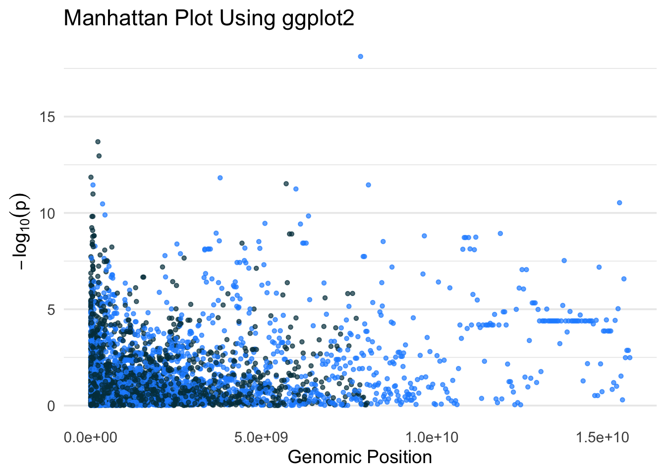
✅ Takeaway: The ggplot2 package allows full control over layout, color, and formatting when visualizing SNP–trait associations across the genome in a Manhattan plot.