Q&A 15 How do you create a QQ plot from GWAS results using qqman and ggplot2?
15.1 Explanation
A QQ (quantile–quantile) plot compares the distribution of observed p-values from a GWAS with the expected distribution under the null hypothesis. It is a diagnostic tool to detect population structure, inflation, or true associations.
You can use:
- ✅
qqman::qq()for a fast and simple plot
- ✅
ggplot2for customization and control over styling and annotations
Both approaches produce a similar result but are suited to different use cases.
15.2 A. Using the qqman package
# Load required libraries
library(tidyverse)
library(qqman)

# Step 1: Load GWAS results
gwas_df <- read_csv("data/gwas_results.csv")

# Step 2: Create QQ plot using qqman
qq(gwas_df$P_value,
   main = "QQ Plot of GWAS Results (qqman)")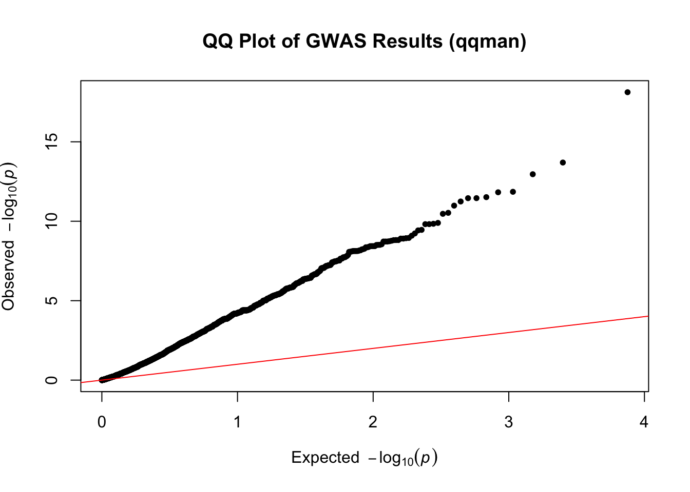
🟢 Simple and fast, but limited in customization (no legend or theming)
15.3 B. Using ggplot2 for more control
# Load required library
library(tidyverse)

# Step 1: Load GWAS results
gwas_df <- read_csv("data/gwas_results.csv")

# Step 2: Calculate expected vs observed -log10(p)
gwas_df <- gwas_df %>%
  filter(!is.na(P_value)) %>%
  mutate(observed = -log10(sort(P_value)),
         expected = -log10(ppoints(n())))

# Step 3: Create QQ plot with reference line using ggplot2
ggplot(gwas_df, aes(x = expected, y = observed)) +
  geom_abline(slope = 1, intercept = 0, color = "red", linetype = "dashed") +
  geom_point(size = 1.2, alpha = 0.6, color = "steelblue") +
  labs(title = "QQ Plot of GWAS Results (ggplot2)",
       x = "Expected -log10(p)",
       y = "Observed -log10(p)") +
  theme_minimal(base_size = 14)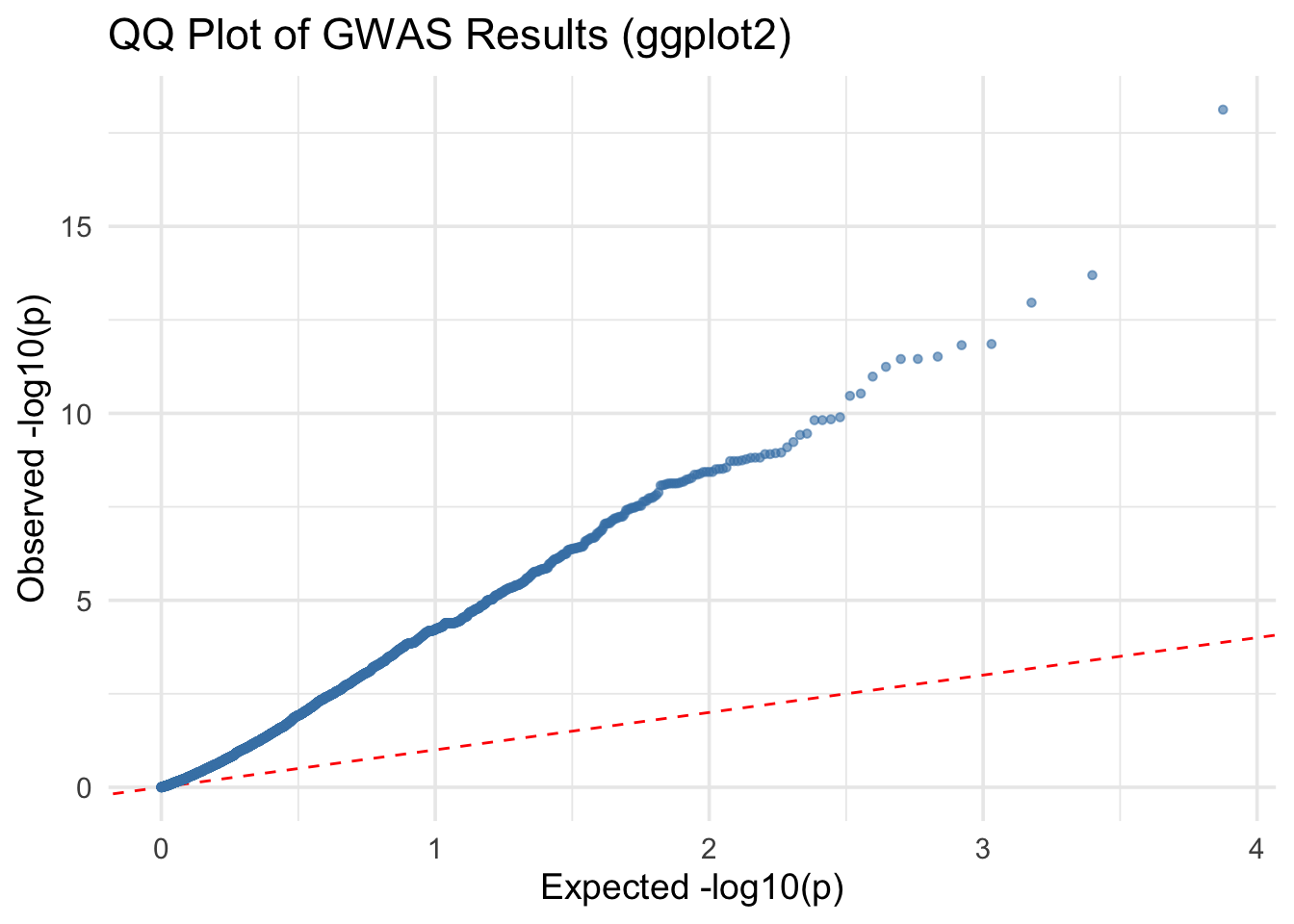
✅ Takeaway: The red dashed line represents the expected distribution of p-values under the null hypothesis. Deviations above the line suggest potential true associations or population structure. Use qqman for simplicity or ggplot2 for full customization.