Q&A 14 How do you create a Manhattan plot from GWAS results using the qqman package?
14.1 Explanation
The qqman package provides a convenient way to create Manhattan plots directly from GWAS result tables. A Manhattan plot displays each SNP’s –log10(p-value) along its genomic position, helping identify regions with strong associations.
The function manhattan() expects a data frame with these key columns:
CHR: Chromosome number
BP: Base-pair position
SNP: SNP identifier
P: P-value from the association test
You can prepare this by merging your GWAS result table with a .map file containing SNP positions.
14.2 R Code
# Load required libraries
library(tidyverse)
library(qqman)

# Step 1: Load GWAS results
gwas_df <- read_csv("data/gwas_results.csv")

# Step 2: Load SNP position data (.map file)
map_df <- read_tsv("data/sativas413.map",
                   col_names = c("CHR", "SNP", "GEN_DIST", "BP"),
                   show_col_types = FALSE)

# Step 3: Merge results with map data
gwas_annotated <- left_join(gwas_df, map_df, by = "SNP") %>%
  select(SNP, CHR, BP, P = P_value) %>%
  drop_na()

# Step 4: Create Manhattan plot using qqman
manhattan(gwas_annotated,
          main = "Manhattan Plot of GWAS Results",
          col = c("grey30", "dodgerblue"),
          cex = 0.6,
          cex.axis = 0.9,
          las = 1)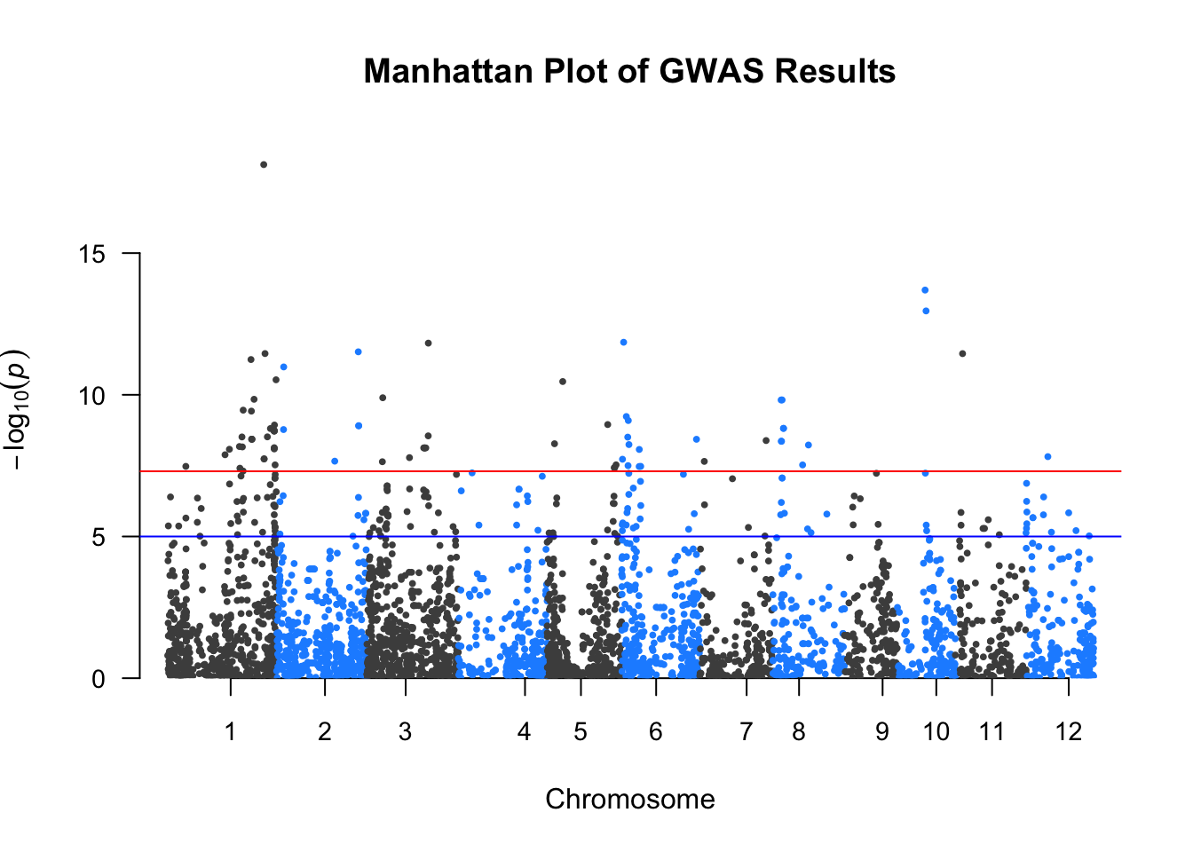
✅ Takeaway: The qqman package offers a fast and simple way to create publication-ready Manhattan plots by plotting –log10(p-values) across the genome using SNP coordinates.