Q&A 17 How do you create a volcano plot from GWAS results using ggplot2?
17.1 Explanation
A volcano plot is a powerful way to visualize both the effect size and statistical significance of SNPs in GWAS results. Each point represents a SNP, plotted by:
- X-axis: Effect size (regression coefficient)
- Y-axis: –log10(p-value), indicating significance
This plot highlights SNPs with: - Large effect sizes - Low p-values (high significance) - Or both
You can also add horizontal and vertical reference lines to help interpret thresholds.
17.2 R Code
# Load required libraries
library(tidyverse)

# Step 1: Load GWAS results
gwas_df <- read_csv("data/gwas_results.csv")

# Step 2: Compute –log10(p-value)
gwas_df <- gwas_df %>%
  mutate(logP = -log10(P_value))

# Step 3: Create volcano plot
ggplot(gwas_df, aes(x = Estimate, y = logP)) +
  geom_point(alpha = 0.6, color = "grey40") +
  geom_hline(yintercept = -log10(0.05 / nrow(gwas_df)), linetype = "dashed", color = "red") +  # Bonferroni line
  geom_vline(xintercept = 0, linetype = "dotted", color = "black") +  # Null effect line
  labs(title = "Volcano Plot of GWAS Results",
       x = "Effect Size (Estimate)",
       y = expression(-log[10](p))) +
  theme_minimal(base_size = 14)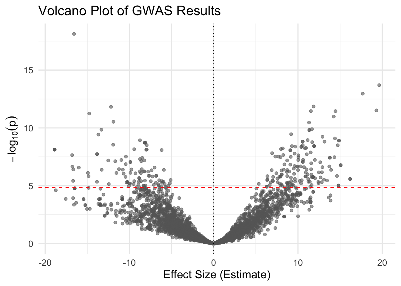
# Add significance status
gwas_df <- gwas_df %>%
  mutate(significant = P_value < 0.05 / nrow(gwas_df))

# Re-plot with color by significance
ggplot(gwas_df, aes(x = Estimate, y = logP, color = significant)) +
  geom_point(alpha = 0.7) +
  scale_color_manual(values = c("grey70", "red")) +
  geom_hline(yintercept = -log10(0.05 / nrow(gwas_df)), linetype = "dashed", color = "red") +
  geom_vline(xintercept = 0, linetype = "dotted", color = "black") +
  labs(title = "Volcano Plot with Bonferroni Threshold",
       x = "Effect Size (Estimate)",
       y = expression(-log[10](p))) +
  theme_minimal(base_size = 14) +
  theme(legend.title = element_blank())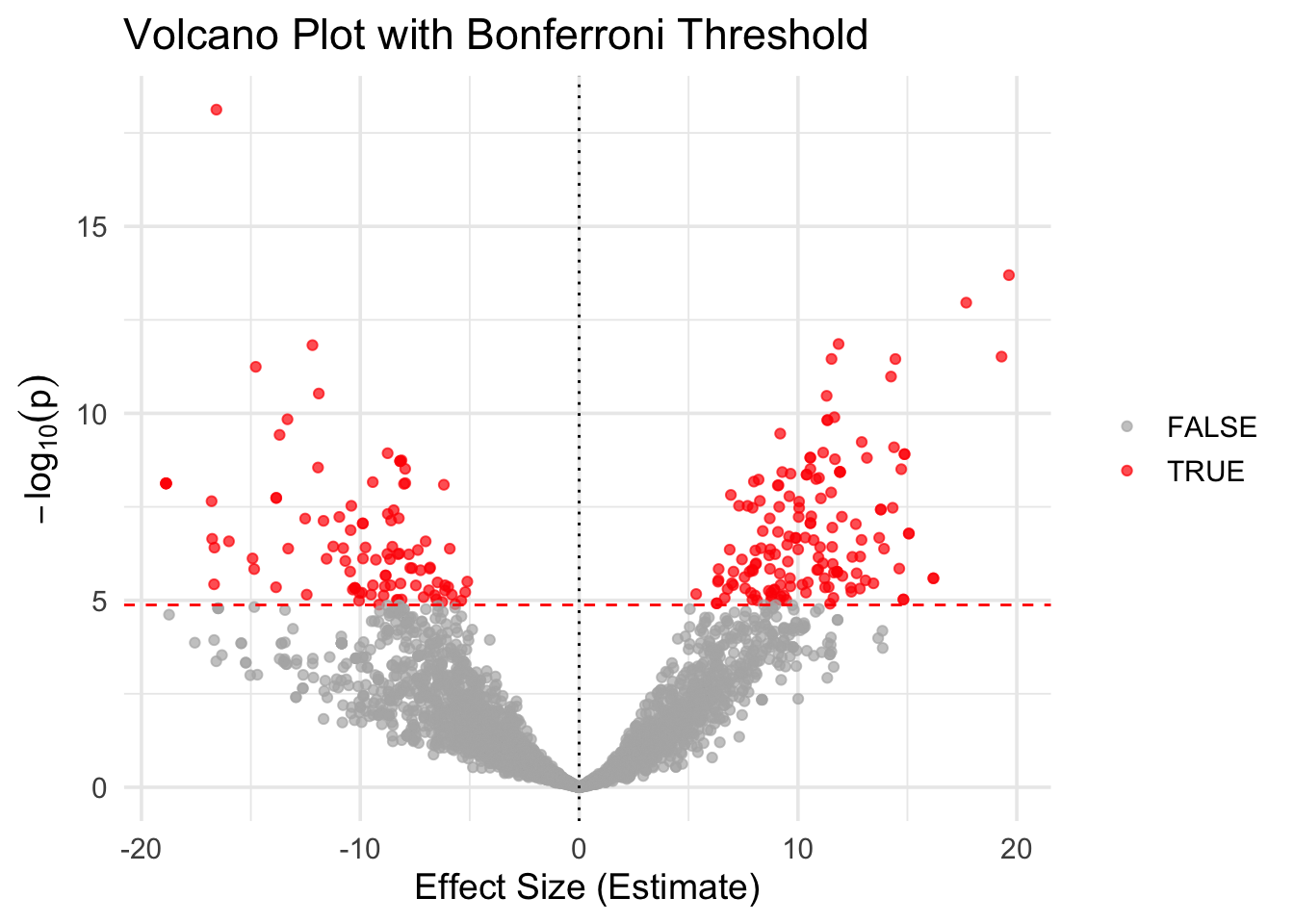
✅ Takeaway: A volcano plot shows the balance between effect size and significance. SNPs with both large effects and low p-values appear as extreme points in the top left or right quadrants.